Lisa Whatmoughs hem

Så här fantasifullt och excentriskt ser det ut i Lisa Whatmoughs London hem. Designern som är känd för sina möbler i lapptäcke men även för sina tyginklädda lampor och tekannor. Du hittar mer av hennes färgstarka och mönsterglada skapelser på Squint. Se även tidigare inlägg. Fler bilder från hennes hem hittar du hos MarieClaireMaison.

Mysigt med en stickad puff

Golvkuddar och puffar är ett perfekt sätt att få en avslappnad och mysig känsla som samtidigt ger extra sittplatser. Det är också ett bra sätt att införa färger och textilier till rummet. De här stickade puffarna ingår i The Bonnet Collection, designade av Liset van der Scheer. Säljs av belgiska Casalis. Via Yatzer.


.....

Idag kan du läsa på svd.se om varför jag inte har några elljustakar hemma hos mig!!

.....

Klassiskt rött och vitt

Av den här bilden fick jag lite julkänslor. Så snyggt med klassiskt rött och vitt och att de använt en modern tredelad skål gillar jag. Tror jag ska ta och handla lite amaryllisar, hyacinter, mossa och lite sånt imorgon. Så man kan göra lite fint inför 1:a advent. Det ska bli kul, kul, kul. Bild från Sköna Hem.

Tror att jag är en naturtyp

Kitschigt rosa i alla ära, men jag tror att jag egentligen är mer av naturtypen när det kommer till julpynt. Det är därför som jag kan bli helt lyrisk när jag ser krukan nedan med mossa och grenar (av kväder?). Även den lilla stjärnan på toppen av granen ihopsvängd av grenar och kvistar känns kul. Vet ni att danskarna inte sätter sina granar i vatten som vi gör utan de spikar fast ett träkryss undertill. De struntar alltså fullständigt i att få den att överleva så som vi har sånt bry med. Fast här har de ställt den i en snygg korg, kul idé. Bilderna kommer så klart från Bo Bedre.


Stockholmsvitt

Ibland kan jag inte låta bli och gå in och kolla lite på de urtjusiga Stockholmsvåningarna som är till salu på Lagerlings. I förmiddags såg jag den här till salu för 13,5 Mkr. Senare samma dag var den borta, ja tydligen var det någon som lagt beslag på den.


Jag gillar tomma rum...

Det ska erkännas att jag har en förkärlek för ganska så tomma rum. Det känns befriande och vackert utan en massa prylar. De här studiolägenheterna som hyrs ut för reklamfoto är ibland så vackra i all sin enkelhet. Innan de fylls med prylar. Borde det inte vara precis tvärtom om man är inredare? Det här är från ett townhouse i Reading. Bilder från Light Locations.


.....

Idag visar jag nya bilder från Living like Lindas hem på svd.se!

.....

En riktigt bra julgransfot

När jag ändå är inne på jul och julgranar kan jag passa på att ge er ett tips om en verkligt bra julgransfot. Snygg och enkel och framförallt så klarar den en rätt stor gran utan att välta. Från Design House Stockholm, bilden kommer från Urban Living.


.
Idag visar jag favoriter i repris på svd.se, nämligen ursnygga inspirationsbilder från Tine K. Missa inte det!

Great Kitchen Design
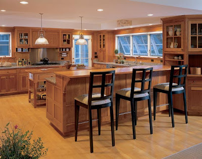
Here is a great design idea I just had to post - this is such a wonderful, ingenious design. I am anxious to use it in my next project. The first view is entering the kitchen. Notice the raised island area where the the stools are placed.
Hutker Architects
Here is the view from the other side. It is the perfect space for storing dishes, bowls and mugs. Isn't that so very clever?

Hutker Architects

I think this design idea would work especially well in a vacation home. Guests getting up in the morning at all different times and they can simply find everything they need without feeling uncomfortable rummaging through the cabinets. What do you think? Like it or love it?

Millstreet - ny butik inom formgivning och design

Är inte dessa julgransdekorationer bara ursöta? Det är Lena Håkanssons design och du hittar dem i en nyöppnad butik som heter Millstreet och ligger på söder i Stockholm. Millstreet är en butik där flera formgivare och hantverkare slagit sig samman för att visa upp och sälja sina alster. Lena fick utnämningen FORMIDABEL på Formex-mässan. Du kan läsa mer om henne på Nonstopdesign.

Playing in Tents!

With summer in full swing, I am reminded by my children the fun of spending the night in a tent. The billowy canvas sides create a secret retreat. Let's look at some more luxurious ways to spend the evening and ways to create this atmosphere in your own home. Hunter Hotels
This is a tented suite from Marataba Safari, part of the Hunter Hotel Group, in the magnificent Marakele National Park, north of Johannesburg in South Africa. This exotic tented suite is a beautiful mix of canvas and stone, furnished and decorated in an African style. I love the way the tent fabric billows above the bed, so luxurious. Notice the en-suite stone bathroom with copper tub. Each of the 12 suites each have their own private deck overlooking the sweeping plains.
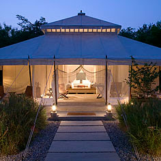
Let's look at another opulent resort for inspiration.

Aman Resorts

Here are the lovely tented suites of Aman Resorts in Rajasthan, India. The 10 air-conditioned tents, have soaring six-metre canopies above draped cotton partitions.
They are designed and decorated in a clean modern style. The subtle hues of creamy canvas, swathes of airy-white cotton, khaki cushions on toffee coloured leathers contrast the soft elegance of the tented exteriors.
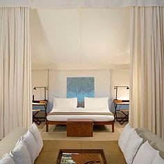
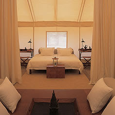
Here is another "bedroom" in the tented suites. Notice the dressing table, comfortable chairs and animal hide footstool. What luxury in a tent!
Amanresorts
Lovely at night and so romantic at sunrise.
The tented suites are enchanting and exotic ways to spend an evening, but lets look at some ways to bring this feeling into our everyday homes.

Marie Claire Maison
The simplest way of course, is to drape mosquito netting over the bed. Here it is done very romantically with the addition of the crystal chandelier above and crisp white linens on the bed .
Marie Claire Maison

Another bed is simply dressed with a gray silk - It becomes more dramatic by lowering the bed almost to the floor and adding romantic sconces.Marie Claire Maison

This room is draped in a simple airy-white cotton, but what makes this room so interesting is the draped, gathered fabric ceiling over the bed. A very traditional bed and side tables, but with the addition of the fabric overhead it becomes a more exotic retreat.


Marie Claire Maison
Here a beautiful canopy is built over the bed and draped with a lovely embroidered sari. I love the purple velvet duvet and the dressmakers' mannequin wrapped in a pretty shawl. The walls, painted cream above and gray below wraps the room in an interesting way.

Marie Claire Maison
White linen creatively hung above low to the floor twin beds. Bright linens cover the beds and a dark accent wall lends a more mysterious feel.

Marie Claire Maison
Here is a more middle eastern feeling room done in bright silks. I love the hanging lantern inside the canopy. Notice the silk screen used behind the bed as a headboard. Deep magenta walls and darker trim add to the luxurious atmosphere.

Marie Claire Maison
Here is a much more modern take on the canopy. I love the crisp, nautical feeling of this bed. The canopy is tied like a sail, bed linens are a soft sun-faded blue. This room is restful and fun at the same time.

Marie Claire Maison

This room also has a nautical feel. A simple way to include a canopy without a custom bed or structure is hang it above the bed with wire and a small rod. I love the bold, blue striped fabric canopy and matching headboard. I also love the bench at the end of the bed. The green stripe on the bench adds freshness

Marie Claire Maison

This attic room uses the angles of the room's windows and fabric to create a tented feeling. Soft quilts and comfy chair add to the cozy cottage feeling. Lying in this bed at night you could easily spend hours wishing on stars.

Marie Claire Maison

We end with a serene outdoor room. Crisp white linen bedding and pillows, airy-white cotton billowing on a deck that overlooks the ocean. Now this is an exciting tented retreat anyone, young or old, would enjoy!

Snyggt i hallen

Sköna Hem kan du hitta flera olika snygga lösningar för hallen. Var sak på sin plats. Det här är min favorit.


.
Idag visar jag nya lampor på svd.se!

Avskavd elegans

Lite avskavd men ändå inte direkt förfallen sekelskiftesmiljö. Snarare någon slags elegant dekadens kanske. Härligt mild färgsskala med flera nyanser av vitt, beige, brunt, trä, guld m m. Här hjälper ju lokalen med stora härliga fönster och högt i tak till en hel del. Men något som man kan ta åt sig och använda även i en annan miljö är stilen och färgskalan. Bilder från Shootfactory.


LinkWithin

Related Posts Plugin for WordPress, Blogger...