Så skönt med lite semester...

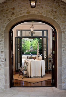
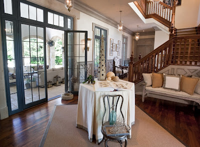
Augusti... och tillbaka till bloggen, hoppas ni har haft det toppen allihop, det har varit väldigt skönt att vara lite bloggledig men nu är det också jättekul att vara igång igen. Under juli hann jag med en hel del, bl a lite semester på grekiska Santorini. Härlig ö med vidunderlig utsikt och riktigt sköna bad både från stränder med svart sand och några hopp från häftiga klippor (nja alltså, jag kanske inte direkt hoppade). Några trevliga hotell hann vi också med, det här är bilder från Rocabella. Spännande mix av traditionellt grekiskt, Philippe Starck plastmöbler och moderna korgmöbler. Kolla gärna in deras hemsida, jättefina bilder. De här är mina egna.

Armchair Shopping With Willow Decor

Since I've been on vacation, and it has been raining most of the time, I have had some extra time to do some Internet shopping. Here are some of my favorite new finds! First, I stopped by my favorite Swedish Antiques site, Avolli, to see Tricia Mitchell's new pieces. I loved this dining table and chairs - It's in her ad in the July/August issue of Veranda - No surprise it's such a classic. I loved this dresser with X design. This could go into any room in my house!

This metal Empire sewing box is so charming! But, my favorite piece is this Mora Clock. Notice the lovely, soft lines of this clock. Many of the Mora clocks I have seen recently do not have a good curve scale, they seem a bit off to me. This one is perfect and unique with the diamond detailing on the bottom. Tricia Mitchell has an incredible eye - check out more of her great finds here.
.
Next I headed over to see what was cooking at Kym Fraser's 3 Fine Grains. Kym's Dressage Chair below was recently featured in Washington Spaces Magazine (but remember you saw Kym first at WD!) Besides creating beautiful furniture; she's been very busy importing some fabulous antique textiles.

Lucky for us Kym is now also selling the antique sacks - so you can create your own custom upholstery, slipcovers or pillows. I was thrilled to learn this because as you know Kym has one of the largest inventories of original, authentic antique sacks in the country - and these textiles are not easy to find!! Imitators are now printing over old sacks (yuck!), but these babies are the real McCoy! They run $350 -$1200 - the sacks are huge and can be used for multiple projects.

I got giddy when I saw this crown sack from 1874 (wow- 1874!) -because she has three of them! What a find!! I would love to cover my dining room chairs with these!

The Horse sacks are really interesting! This one caught my eye because it is printed on both sides so I could make a bunch of pillows or cover a couple of chairs

Here is the back - aren't these fabulous?!! Now I just have to figure out what I am going to make with them. Of course you can always just have Kym make it for you - check out her new pillows and furniture.
.
From antiques I moved on to see what was new at Anthropologie.
This interesting lamp caught my eye. It reminded me of a French whimsical line drawing turned 3D. I especially love the two french bistro chairs with toile pads and table in the center. So unique! The lamp is called the Chateau Lamp and you can find it here. Do check it out so you can see a real close up.
.
Because it was still raining and I've got nothing but time, I thought I would check out this new site called Former Furniture. The site, started by an interior designer, features used furniture that her elite clientele want to sell when they are ready to redecorate.

They have some really interesting things. This vintage cabinet caught my eye because it reminded me of the metal desk we just saw in Linda Banks' new kitchen. Check the cabinet out here.
.
Meanwhile over at EBAY, I found these really neat vintage industrial stools.

These zinc and metal stools are from EBAY power seller The Antiques Warehouse in Cinncinatti, OH. Many styles were for sale for under $200. Shipping was reasonable too! A great find!

They also had these chairs, which look close to Kristin's kitchen chairs from Covetable Designs. I was on a roll!
.
Then, I stopped by to check out what new things were listed from my favorite Antique Textile Queen -"Loodylady" from EBAY's Textile Trunk. I was in awe of this 19th Century French Ceil de lit Bed Canopy. Made from blue and white Ikat fabric. What a rare find! Spectacular! Look at this lovely antique Toile de Jouy quilt from 1790. I bet Marie Antoinette had one just like this!Then I found these gems - gorgeous antique monogrammed French Sheets. The monogram and detailing are spectacular! Who knew such treasures were on EBAY? Finally I found this antique cart cover - Wow - I could just throw that over my sofa and change the entire look of my room! To see all her exquisite textiles click here.
.
Well the sun is starting to peek out so I am off to enjoy the beach - hope you enjoyed our Internet shopping trip!

A Visit with Covetable Designs
I feel so lucky to be able to meet such wonderful people through Willow Decor. Just the other night I received a sweet email from a fellow blogger, Kristin at Covetable Designs. She had been overwhelming busy, she said, and tonight she finally had some free time to relax and catch up on reading my previous blog posts. I was so flattered. We started emailing back and forth and it turned into a great treat for me, as I learned so much more about this talented designer! We had so much in common, both having lived in Europe for several years and traveling around; both with a passion for renovation and both self taught designers. I am just in awe of her abilities, so I wanted to share a few images of her home, which she designed, in Dallas.
The above photo is a French dairy turned restaurant that Kristin visited and one of many inspiration photos she used to help design her kitchen. After living several years in London, she was influenced by how her friends lived there.
"They did not view their historic homes as museums, slavish to all the detail of the period. Rather, they used contemporary furniture and accessories to lighten up and streamline their homes. The juxtaposition was thought provoking to an American who was taught to respect period decor, restore old homes, and preserve vintage architectural detail at all costs. And I couldn't really find a designer here who was exactly on my same page. So, I took the lessons of lightening and streamlining to my new home. I wanted architectural detail that was European in feel, without being constrained to any one period or style and I designed the interiors with an eye toward creating a particular mood in each space. The element that ties them all together is the use of neutrals as a backdrop, allowing the colors in fabric and furnishings to glow or in some cases, pop. "
Above is Kristin's new kitchen. Do not be fooled, this is not a renovation of an old home, but a meticulously designed new home with all the elements of an antique. I love the zinc counter and the metal hood, painted to look like aged zinc. Of course I adore the X cross motif which she incorporated in many areas of the design. The Marston Langinger lantern is perfect!
What I find most impressive is the window design over the sink. Kristin boldly painted that area in dark gray and the results are stunning.
A close up of the stove area reveals that she used an antique French fireback as a focal point. The herringbone patterned limestone and the sconces add to the aged French feeling.
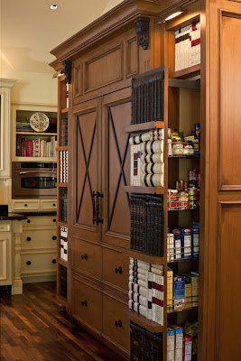
We see the X cross motif translated again on the refrigerator. The pantry pull outs are faced in old books. Very clever.
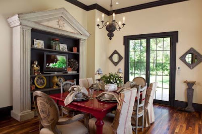
The breakfast room is a delight! Notice the mix of chairs. Some are upholstered in old German printed grain sacks, while others are slipcovered in striped sacks. Visit her blog to see how she transformed the wooden table and chairs. The zinc elements tie the room in well with the kitchen. Again Kristen takes a bold chance with the red table, a viola, it pays off. The fabulous bookshelf was a exciting find at Mecox Gardens.
Here is the beautiful entryway.
It is crafted so well its hard to remember this is new construction. Notice the wood banister and wainscoting.
Here is a closer image of the wainscoting. Isn't this wonderful design? The glazing/painting technique really adds a wonderful patina to the space.
The other wall of the entry has these two wonderful Aidan Gray chests flanking the niches in either side. The wonderful old doors behind the chests were from the bookcase above. Beautiful!!
I have read every one of Kristin's posts and marked several in favorites folder. I am so excited to see more of her work in the coming months. Do check out Covetable Designs, and when you do, tell Kristin that Gina from Willow Decor sent you!!
.
Go see Julia at Hooked on Houses to see what others are Hooked on!
.
~Never miss a post - Subscribe to Willow Decor in the upper right corner~

Spectacular Pool Houses!

Finally some sun is peeking out from the behind the clouds in Boston and it makes me want to grab my sunglasses and head out to the pool. What better place to recharge than in one of these lovely pool houses designed by our talented friends at Catalano Architects.
This is a beautiful pool house on the grounds of a spectacular home in Barnstable on Cape Cod. I love the roof lines of the building. It really shows off the traditional cedar shake roof shingles The inside of the pool house is perfectly outfitted for guests with a mini kitchen
and family room area. Notice off to the left a staircase to a second level and to the right what looks like a pantry/towel room.
It also houses a wonderful bunk room. This picture may be familiar to many of you as I have shown it before in my post on Built in Beds. This particular bunk is one of my favorites! To view even more photos of the Barnstable main house and interiors click here.

Our next spectacular pool house is only a short drive west of Boston.

Unfortunately, this pool house was not open yet for the season but you can still see the wonderful architecture and design of what clearly is a fabulous pool area. The "great" room is in the center and two smaller rooms flank either side. Notice the cupola and window.

Here is the view of the "great"room. The ceiling is an amazing work of art. Notice the large lantern hanging inside the cupola. You can almost see how wonderful the light plays in this space.


Another angle of the great room which includes a full kitchen, center island seating, dining area and family room space.

Here is one of the rooms flanking the "great" room. I love the use of stone on the interior walls and it is a nice contrast to the "great" room which is predominately wood.
To view more photos of the main house and interiors click here.

Thanks again to Catalano Architects for giving us a private look into these incredible properties. Check out their website for more of their inspiring work!

Another Peek in to Linda Banks Home

As promised here is another peek into Linda Banks' new home in Maine. She has wonderfully transformed a 1960's ranch into beautiful "loft meets barn" home.
Looking from the kitchen into the living area we see Linda continues her very neutral palette.
This room also boasts the high ceilings painted in a pale blue.
Wonderful bookcases anchor this room. I especially like the interesting lighting above them.
Architectural details abound. Notice the way Linda made the doorways higher than traditional doorways and beefed up the depth of the entry and exits. These things bring a weight and added interest into the room. I adore this table - It has a more delicate apron than the cabinets but I like how she tried to repeat this feature in the living room. Again her love of antique signs is evident - although the sign above is not an antique and available for sale at her shop, Simply Home.

Here is a wonderful shot of the exterior custom milled french doors. You know I am a lover of the X cross tops! Notice the height of these doors as well.


Here is a view of the exterior of the house.

And a close up of the doors from the outside. Linda added the stone faced exterior. The zinc planters are the perfect scale and size.
Here is a view of the living area from the loft/office space above.

Here we are back in the breakfast area/keeping room looking toward the family room and the stairs to loft/office above.
In the family room looking out toward the keeping room. This neutral room is accented in wonderful, fresh green.

Legumes sign, woven chairs, aged coffee table, an architectural fragment of a column in corner all add texture and visual interest.


I love how Linda placed the antique dressmakers mannequin in the corner.
Lets head upstairs to the loft/office/studio.
Here is an interesting transition in the rooms above.
And here it is from a different angle.
Here is the office area - The pear chairs are very interesting. Also notice the hanging lantern and built in drawers in the dormer. The Guest bedroom is very cozy. This is the only room we see any window treatments at all. Horizontal boards lend an interesting change to the vertical beadboard in the other parts of the house.
A lovely vignette! A wonderful bath - notice that again wall boards are hung on the horizontal. The mirror is an antique from Linda's personal collection.
Beautiful mouldings and star hooks add charm to the Mudroom. Also notice what I think is an interior window - it brings in great light and a feeling of spaciousness.
Finally, another view of the Living Room - The interesting dragonfly mirror is a custom design by Banks and available for sale or by mail via her wonderful shop, Simply Home. Read more about the building and design process in Maine Home and Design.
Thank you Linda, for the wonderful tour of your beautiful new home!
Subscribe to Willow Decor and never miss a post.

LinkWithin

Related Posts Plugin for WordPress, Blogger...