Invest in Your Nest with Mitchell Gold & Bob Williams

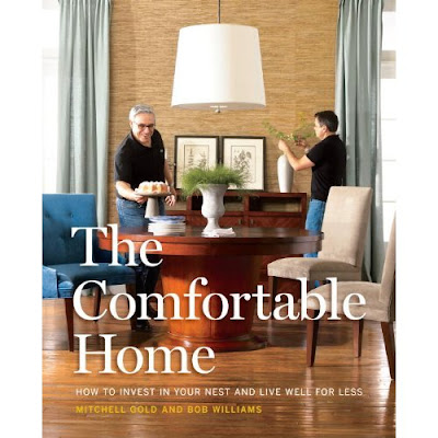
This week marks the release of Mitchell Gold and Bob Williams' new book Comfortable Home How to Invest in your Nest and Live Well for Less. A timely book that is sure to add value to your home and decor with photos and step by step instructions to help you enhance your home.
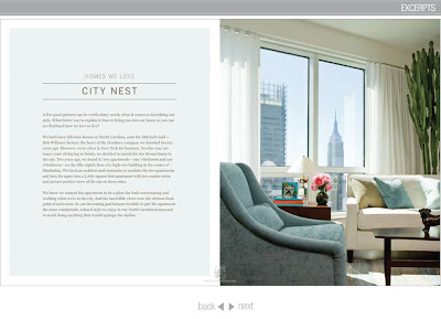
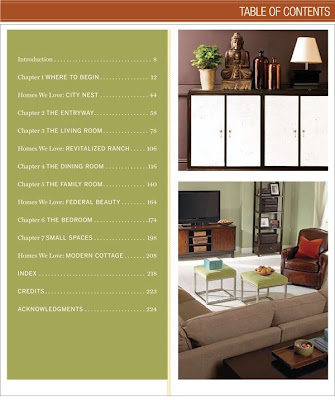
Mitchell Gold and Bob Williams believe that, in any economy, your home is an incredibly smart investment. Its value goes well beyond what current real estate prices may say. A beautiful, serene, and organized house truly has the power to change your life. And investments can be made on any budget. The table of contents give you a good peek into what looks like an interesting mix of styles applicable to many different decors. Throughout the book, fabulous original photography provides stimulating tours of real homes, including Mitchell and Bob’s New York City apartment, a country cottage, a revitalized ranch, and a Federal-style home in the city.
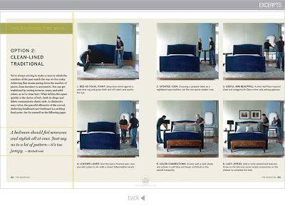
Using Mitchell and Bob’s great ideas for working with color, you'll learn the art of furnishing small spaces, creating room to-room flow, and more. The book gives step by step instructions - wonderfully staged so anyone achieve their classic looks.
.
Mitchell Gold and Bob Williams were kind enough to provide a copy of their new book to Willow Decor for a giveaway. If you are interested in winning this fabulous new design book just leave a comment. As always, followers and subscribers of Willow Decor are automatically entered. Special thanks to Mindy Drucker co writer of the book!
.
You can purchase the Comfortable Home How to Invest in your Nest and Live Well for Less here and learn more about Mitchell Gold + Bob Williams here. Winner will be announced Friday, November 6th.
.
Happy Halloween!!!
xx- Gina
.
(BTW, Willow Decor is just a fan of Mitchell Gold, their products and design philosophy.
No services or compensation have been received in exchange for this post.)

Hanna Säfströms textilier

Hanna Säfström är ny textildesigner som bl a ställde ut under Formex i augusti. Hennes tyger är vackert handtecknade och inspirerade av naturen. De finns att få som kuddfodral, brickor, bäddlinne och som metervara. Bilderna är pressbilder.


Valorie's Room in the Semi Finals!

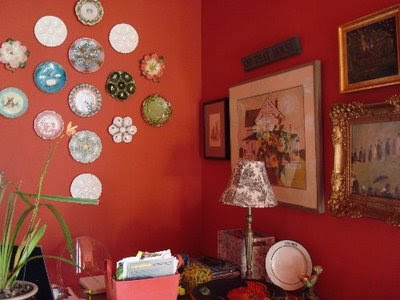
Remember my trip to New Orleans and my great blogging friend, Valorie from Visual Vamp ? She shares my love of antique oyster plates!
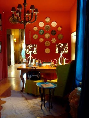
Well the very talented Valorie has made it into the semi final round of the Apartment Therapy Room for Color Contest.
Valorie's office is fabulous. We only have 24 hours to vote for her. Please give her room a look - I am sure you will agree it should get the top honors. To vote click here.

Grattis!

Vinnaren av de vackra marschallhållarna från Röshults är - Jenny G!

Grattis Jenny! Hör av dig till mig så kommer de med posten, du hittar min mail i kanten.

Kalasformar

Så här i höstmörkret känns det som om man vill stoppa i sig kakor i mängder. Visst är de fina kakformarna från Kalasform? Jag kan tänka mig att det blir extra kul att sätta igång med bullbak med så fina formar. Bilderna är pressbilder.

Ljuva 70-tal

Den här lägenheten i Köpenhamn ger mig ljuvliga flashbacks till 70-talet. Titta bara på glasknopparna i hallen på den bruna panelen, 70-talet i ett nötskal. Även soffan byggd av madrasser och naturligtvis de vackra kuddarna. Hade det här verkligen varit på 70-talet hade nog även köket varit brunt. Bilder från Anna Lilja.


......
Idag är sista dagen för utlottningen av Röshults vackra marschallhållare, imorgon presenteras en vinnare!! Skynda dig att tävla!

Eldigt och intressant

Det här hemmet såg jag för flera år sedan i någon av de svenska inredningsmagasinen. Kan inte minnas vilket, men bilden av den runda soffan har satt sig i minnet. Det är en inredning som håller än. Den är skarp och lyxigt avskalad men utan att för den skull vara tråkig som man så ofta ser, snarare är den eldig och intressant med sina orange toner. Lägg märke till hur snyggt det blir med ett mörkt golv i en så pass ljus lägenhet och hur häftigt det blir när man utgår från en tavla i färgsättningen. Bilder från fotograf Patric Johansson.

Melbourne, anyone?

Det här huset hittade jag via bloggen Desire to Inspire. Det är ett gammalt renoverat Victorianskt hus i närheten av Melboure i Australien. Huset är renoverat av ägaren som är arkitekt och enl försäljningsinfon andas huset europeisk 'grandeur'. Vilket man kan hålla med om, men det som jag tycker är speciellt med den här är att det är så många olika inredningsstilar, gammalt, nytt, natur, retro, 70-tal, 60-tal... ändå har man på något sätt lyckats få ihop helheten. Bilderna som här kommer i ett helt gäng, i sann Desire to Inspire anda, kommer från realestate.com.eu.

Badrum med bevarad känsla

Vackert 60-tals badrum med blågrön mosaik, putsade väggar och teakdetaljer. Kul att se att man har bevarat och förstärkt den ursprungliga arkitekturen istället för att renovera sönder. Bilder från ett reportage i Sköna Hem.


Inspired by Christopher Peacock!

Since my first post on Elements of Christopher Peacock Kitchen and the follow up posts, Lighting in a Peacock Kitchen and Hardware in a Peacock Kitchen; I get weekly emails from homeowners and decorators alike, asking more specific questions on how to achieve the look. My hat's off to Peacock and his wonderful classic design which resonates so strongly with people worldwide. Unfortunately, his kitchens are out the price range of many homeowners, so trying to create this look on a budget is more often the topic of the emails.
Last summer I received several emails from Interior Designer, Celeste Randolph of Los Altos, California. She was adding 1500 square feet to her 1950's ranch house and wanted the Peacock look with "chunky counters and flooded with natural light" We exchanged emails about sources, paint colors, hardware, marble, etc. She loved the Peacock look, but wanted to recreate it and stay with in her budget. Celeste recently sent on her finished renovation photos. As you can see, she is very talented and her kitchen renovation was a huge success.
Her attention to detail was outstanding. She left no stone unturned. Notice the moulding details, apron front sink, wood free standing island and gorgeous marble counters and backsplash. Celeste found some wonderful hardware. Also notice her interesting lighting over the windows flanking the stove. Neither are exact copies of Peacock, but they give her kitchen a more personal, chic style. Her kitchen, just like many of Peacock's, is classic and timeless, but also more personal, fresh and updated.
Of course Celeste's talent is not limited to kitchens. She also wanted a gorgeous Master bath too! Here Celeste's use of marble and light is breathtaking! I adore the herringbone marble floors, tub and wall tiles. And, isn't the chandelier fun?
Her choices of mirrors over the sinks and sconces are wonderful. And the window and the natural light really take my breath away. I also like how Celeste added the rather contemporary leaning mirror in the bath. It adds an interesting designer touch.
She also updated her living room with a warm, neutral palette.
Celeste did a fabulous job of recreating the classic Christopher Peacock style in both her kitchen and her master bath. To reach Celeste contact her at Ambiance Interiors in Palo Alto. Thanks Celeste, for sharing your fabulous renovation with us - we will be anxious to see more of your work in the future!
.
Never miss a post! Don't forget to Subscribe in the upper right corner!
(all photos property of Celeste Randolph)

LinkWithin

Related Posts Plugin for WordPress, Blogger...