{ Looking for new chairs? }

Maybe you like these? I think they are kind of cool.
You´ll find them at "west elm".

 Pictures from west elm

Coastal New England Ocean Oasis

One of my favorite parts of writing Willow Decor is getting to know the many other talented designers, architects, artists and residential photographers that make these beautiful spaces come alive. Meeting photographer Jamie Salomon was one of these special connections. Whether you are aware of it or not, you most likely have already seen his work. It has been featured in many magazines including, Coastal Living, Better Homes and Gardens, New England Home and several others.
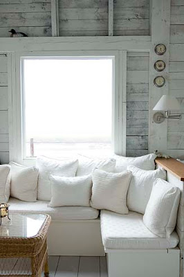
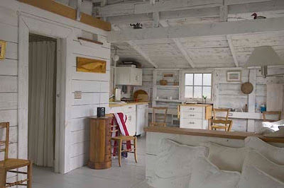
He shared with me this wonderful cottage renovation on the New England coast. As you can see the home is located out on a peninsula. At high tide it becomes an ocean oasis. Though small, it is filled with everything you need to relax. The main room above features a kitchen nook and desk area.
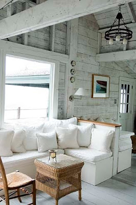
Decorated in soothing whites and grays it is impossible not feel your tension rush away with tide. The cottage is sparsely decorated; intentional so you take in the spectacular ocean views. Here is the couch area from a different angle. I love the whitewashed walls which remind me of sun -bleached driftwood.
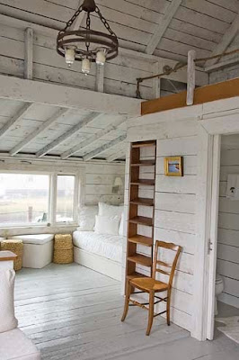
Opposite the seating area is a ladder to the loft above and a daybed tucked below. As you can imagine the views from every direction are breathtaking.
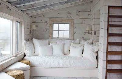
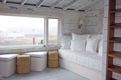
Here is a close up of the daybed overflowing with soft pillows. The wonderful sconces provide just the right light for curling up with a good book. With this view I am quite sure I would never leave - it gives a whole new meaning to word "bed-rest"!
Except of course to sit out on the deck and cast my line - Perhaps fish for dinner??
Have a wonderful relaxing weekend!
To see more of Jamie Salomon's work click here.
.
(photos J. Salomon Photography - not to be copied with out permission)
Never miss a post!! To subscribe to Willow Decor click here

{ Saturday inspiration from Rivièra Maison }


Pictures from Rivèra Maison

Skön harmoni med detaljer i trä

Det här huset var från början ett stall men har byggts om till en ljus modern bostad. De härliga bjälkarna i taket behölls och sätter en speciell karaktär på hela hemmet. Trämöbler i både olika träslag och tidsålder gör att totalintrycket blir en skön harmoni. Bilder från stylist Katrine Martensen-Larsen, fotograf Kira Brandt. Via Desire to Inspire. Du hittar fler bilder här.
.

{ H&M- Flirting with colors }

Pictures from H&M Home

{ All about Purple }

Purple is royalty! A mysterious color, purple is associated with both nobility and spirituality. The opposites of hot red and cool blue combine to create this intriguing color.
Let´s go purple this weekend!


Pictures from Laura Ashley

Antique China

Today is the 79th Tablescape Thursdays over at Between Naps on the Porch, so I thought I would share with a you a recent gathering I had where I used my antique Johnson Brothers green china.

You might remember that one of my goals of my Butler's Pantry renovation was to build some beautiful glass front cabinets to house these precious antiques. You can read all about the Butler's Pantry here.
But what good is China if you are only going to look at it behind glass? I decided to set it out for everyone to enjoy. You can see the antique soup tureen above.
I used Lemon Cypress trees as the centerpiece and pulled out my Apilco chocolate cups for individual arrangements at each place setting. I just put in a spring of greens and some berries.
You can see the bone dishes on the right - we used these as interesting bread plates.
And the covered dish held butter pats I made in pretty butter molds. I should have taken a photo of those!
I'll reveal the rest of the Dining Room on Monday but until then remember to enjoy your china and don't just keep it hidden behind glass.

Head on over to Tablescape Thursday to see more wonderful tables!!

{ Get happy with Green Gate }

This is far the most loving collection I have ever seen! Green Gate from Copenhagen makes so many adorable things. I can feel the summer on my skin when I see these colors. I simply just love them!
They have so much more in their Spring Collection, but this will give you an idea...
Enjoy:)


Smart lösning för att få tv'n att försvinna

Den här bilden kommer från ett av mina tidigare inlägg om ett hus inrett i svart och vitt. Då såg jag inte ens att det satt en tv på väggen. Upptäckte det här av en ren slump när jag satt och letade efter något helt annat. Hur ofta blir det inte så att tvn sabbar inredningen i vardagsrummet. Simon Davies har ju också också haft åsikter om det här - 'Ett hus ska byggas runt spisen och inte runt the bloody television'. I det här huset har man hittat en egen lösning på problemet - svart tv på svart vägg med kablarna i en svart ränna. Hur enkelt och smart är inte det? Bild Hettinger.

About the Italian Chandelier!

Many of you have emailed me asking more information about my chandelier. My interior photography is ever evolving (aka. not very good) and many of you wanted better photos. I was unable to get them because of the light. If you click on my photo above it should enlarge and give you more detail. But, if that does not work for you, I did have a few professional shots of the chandelier in my inspiration files.
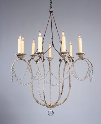
The chandelier is made by Niermann Weeks. It is called the Italian Chandelier and comes in both 9 arm and 12 arm sizes. The photo above shows what is considered the standard finish - a distressed, chippy white. My chandelier was custom finished in an antiqued silver - it has a beautiful depth of color. Niermann Weeks has many many different finishes to choose from.
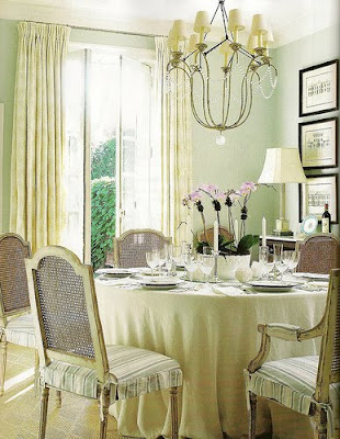
This photo from Things that Inspire via Anne Hepner gives you a very good shot of the piece. This example shows the fixture with shades, which I opted not to do. Here you see how nicely it looks in an informal room. This photo from Things that Inspire via Caldwell Beebe gives you a clear picture of the crystals that surround the fixture. I like the sparkle the singular strand brings to the room. It add a interest but its not too fussy. This room is also lovely, though a bit more formal than my breakfast room, but notice the similarities in the chair style and curtain selection.
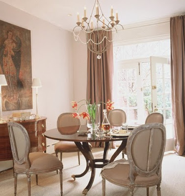
I am sure you recognize this room from Better Homes and Gardens, which has been all over the blogs. Here you can see an example of the 12 arm style.
Niermann Weeks writes about the Italian Chandelier on their website.
They first found antique sconces, which led to the design of the chandeliers. They mentioned that English designer Nina Campbell hangs the Italian chandelier in her own bedroom, and every time she’s moved, it’s moved with her. The photo above is not Nina Campbell's bedroom, but another gorgeous room from the talented Catalano Architects.
'
Holly at Things that Inspire did a wonderful, comprehensive post on the Joe Niermann and the Niermann Weeks company. To read more about it click Here
'
The Niermann Weeks Company also writes an interesting article about how the design of the Italian Chandelier came about. To read more click Here.

To read more about my Breakfast Room click Here. Let me know if you have any other questions!

{ SIA Home Fashion´s spring collection }

Pictures from "Sia Home Fashion"

LinkWithin

Related Posts Plugin for WordPress, Blogger...