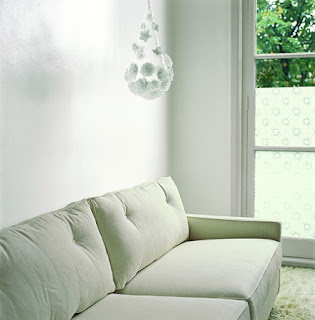
Lägenhet på Strandvägen i Stockholm med underbar ljussättning och ett häftigt tornrum med inbyggd kuddhörna som verkligen är något ut över det vanliga. I vardagsrummet finns den coola soffan från Minotti som jag på den senaste tiden blivit otroligt förtjust i. Den här soffan är precis en sådan armstödslös sektions variant som jag skulle vilja ha i mitt eget vardagsrum om den bara inte varit så skrattretande dyr. Från reportaget 'Ljussatta Kontraster' i Sköna Hem, fotograf Åke E:son Lindman.
|
|
|---|
|
|---|
Grön oas i Limhamn
Köpte Sköna Hems extratidning 'Outdoor living' och fick syn på ett reportage från trädgårdsdesigner Anders Mårtenssons hem i Limhamn. På en yta på 330 kvm har han skapat sig och familjen en prunkande grön oas i asiatisk stil med mycket gröna växter som bambu och murgröna. Trädgården har ingen gräsmatta som behöver klippas och kräver minimal ogräsrensning. Hur fräckt som helst. Bilder från fotograf Sophia Callmer.


Swedish Decor in the Hamptons
 Here is a lovely home in Sagg Harbor designed by Heiberg Cummings Design. Known for their contemporary Swedish design mixed with old world antiques; they create interiors that are interesting and layered, as well as light and airy. This home is clearly influenced by the Swedish style but tempered with traditional beach house design, creating a warm and inviting atmosphere.
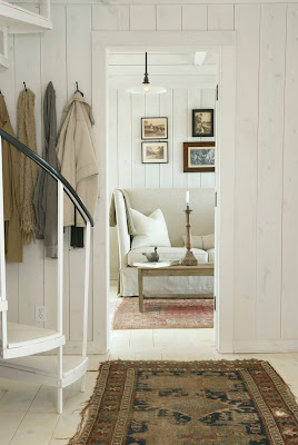
Heiberg Cummings is known for its combination of light, simplicity and subdued colors. Notice how the walls are lightly washed with white, but instead of harsh and stark, they seem luminous and soft. You can still see the knots of the wood peeking through. I love the addition of the old, worn rugs; notice the fraying ends. The rugs add an interesting layer of warmth against the white wood walls and painted floors. Also notice the sofa's interesting lines and use of linen slipcover.


Lets take a closer look at the details that warm up this space. Notice the texture all over the room. On the floors we have worn oriental rugs, a rope knot as a door stop. Rising up you notice Linen slipcovered furniture, old washed wood tables scattered around the room, a barn wood lamp with linen shade, and even the addition of worn leather books. The windows, take on a more modern feel; adorned only with shades. All these elements add layers of warmth and interesting texture to this space.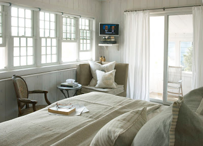

Moving into the bedroom we see an antique chair mixed with new slipcovered upholstery. Bed linens are all natural materials that look soft and inviting. Notice the obvious lack of color which creates a soothing subdued natural palette. Pull down shades in lieu of drapes on one wall look clean and contemporary.

The bathroom is a mix of old and new. Notice the sleek light fixture and the antique Swedish chair, both elements pop because of their juxtaposition.


Heiberg Cummings Designs has offices in New York and Norway; above Bernt Heiberg and Bill Cummings. They have designed some wonderful furniture with Norwegian company, Hodnebo. Below are just a few of their lovely new pieces.


Do visit Heiberg Cummings Design to see many more wonderful interiors and visit Hodnebo to see more of their collaborative efforts.
Skandinaviskt på Desire to Inspire
Wow, idag är både jag med mitt hem och Pethra med sitt tjusiga sovrum med på bloggen Desire to Inspire. Missa inte det. Tack Jo och Kim!
Classic Nautical Design by Suzanne Kasler
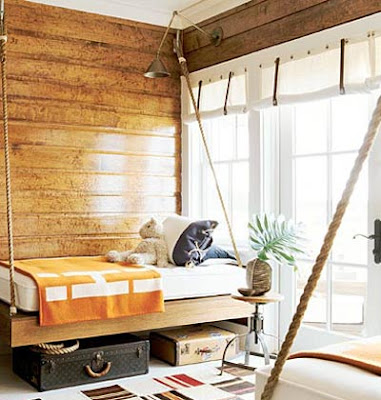
Spring is on its way and I recently opened up my beach house for the summer. In my research on Suzanne Kasler I came across her work on the 2004 showhouse for Southern Accents at Watersound Beach. But 2004 is so long ago you say - I want new and updated! Suzanne Kasler proves yet again, that classic style is timeless! 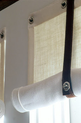

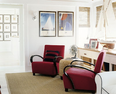 Suzanne brings in texture with the seagrass ottoman, the rug, the woven shades and the baskets. She completes the look with a vintage pond yacht model and sailing prints. I also like the touch of the vintage style electric fan. I think the noise of that fan would really add to the experience of this classic room.

So let's spend a moment to review her wonderful interpretation of the classic nautical theme for those of you who may have missed it. 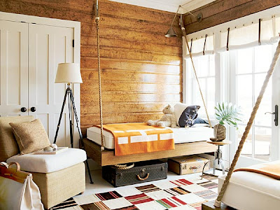 Notice Suzanne's use of horizontal hung wood paneling finished with marine like varnish. This detail along with the yacht like fittings and the bunks attached to the walls with boat cleats, really gives the feeling that you are in the cabin of a boat. Swing-arm lamps, installed high on the ceiling for reading in bed. I especially like the sailcloth curtains, hung with rivets and and tied with top stitched leather fittings. All these elements bring your eye up and down around the room.
 Notice Suzanne's use of horizontal hung wood paneling finished with marine like varnish. This detail along with the yacht like fittings and the bunks attached to the walls with boat cleats, really gives the feeling that you are in the cabin of a boat. Swing-arm lamps, installed high on the ceiling for reading in bed. I especially like the sailcloth curtains, hung with rivets and and tied with top stitched leather fittings. All these elements bring your eye up and down around the room.
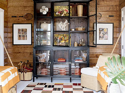
Antique badminton racquets mounted on the wall and a basket of vintage croquet items flank the cupboard, filled with assorted finds from the sea mixed with books and vases. The patchwork rug and seagrass chairs all subtlety give you the feeling of the beach in a classic and sophisticated way.

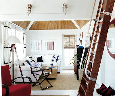
Here is another room from the showhouse. Like the room above this room also uses the warm varnished wood, but on the ceiling. Notice the sea inspired lights and nautical ladder to sleeping loft above. White slipcovered couch is welted in navy blue.

The propeller fans, lacquered red cabinets, and a porthole-like mirror, evoke the feeling of being on a ship; again in a very soothing, non kitschy way. And, again your eye moves up and down around the room as the details gently unfold themselves to you.
 Suzanne brings in texture with the seagrass ottoman, the rug, the woven shades and the baskets. She completes the look with a vintage pond yacht model and sailing prints. I also like the touch of the vintage style electric fan. I think the noise of that fan would really add to the experience of this classic room.
 Wanting a sophisticated and classic nautical style? Look no further!
To see more of this house visit Southern Accents Watersound Beach Showhouse.
Orientaliska lyktor
Två bilder från Tine K som har några år på nacken men som känns inspirerande i den lite orientaliska stilen och fortfarande väldigt aktuella.
Vår i min trädgård
Hörde att det skulle bli över 20 grader varmt i Skåne imorgon. Låter riktigt härligt. Jag kom att tänka på alla vårblommor som kanske snabbt blommar över om det blir så varmt så jag gick ut med kameran och fotade lite.
Rosa lila och sliskiga tabun
En journalist frågade mig för en tid sen varför bloggen heter Purple Area. Jag svarade ärligt att det är för att min favoritfärg alltid har varit rosalila eller fuchsia som man ibland säger. Sen ville jag ha ett engelskt namn och inte svenskt eftersom jag då inte visste om jag skulle skriva på svenska eller engelska och så blev det till slut Purple Area. Då svarar hon, nej men är det rumsrent, är det inte lite tabu att erkänna att man gillar rosa och lila, det är ju lite sliskigt. Jo kanske är det så, men man gillar det man gillar och man behöver inte alltid bry sig om vad alla andra tycker. Så här kommer lite blandade rosalila bilder från TineK, Kråkvik & D'Orazio, Living Etc och Debi Treloar.
Labels:
Dekoration,
Färginspiration,
Fåtöljer,
Förvaring,
Kuddar,
Öppen spis,
Puffar/pallar,
Soffbord,
Soffor,
Sovrum,
Vaser/blommor
Subscribe to:
Comments (Atom)


.jpg)


