"Renovating My Beach House" really should be titled "How I Finally Convinced My Husband To Let Go of the Stained Wood Walls". You see men love wood walls. For seven years, my husband and many of our male friends would actually cringe when I told them I dreamed of painting it all white. "No, No they would say, this room looks like a mountain lodge; it reminds me of hunting and camping!" And, I would argue "WE ARE AT THE BEACH!"

Over time I renovated every other space in the house. Lady luck finally smiled on me when our heating bills got too high. "We really should replace the single pane glass windows," my husband reasoned. Of course the original windows were odd sizes and to save money we needed to buy stock sizes. New cut outs in the wall meant new trim mouldings. The original walls were an orangey stain which I couldn't even begin to match, and all of sudden we HAD to paint! So really this post should be titled " The Magical Transformation with Paint" because that is what it truly turned out to be.
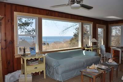
The photo above is the house as I bought it seven years ago. It is our living room and dining area taken from the original real estate listing.
 Here is living and dining area before we painted.
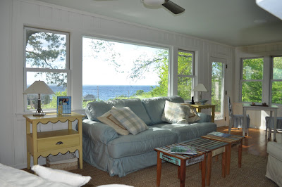
A few gallons of primer and some Farrow and Ball Paint in Pointing and even I was amazed at the transformation!
Here is the fireplace. No matter what I tried I could not remove the 40 year old soot stains.
 Paint hides everything!
The antique dish cupboard used to just blend into the wall.
And now it is a focal point in the room.
I've been playing around with some shells, dishes and antique pewter and here's what I came up with. I love to change the accessories, but for now I really like this monochromatic look. Oh, and the baskets below hold flip flops - it keeps things more organized in the entry area.

Here is the couch area before - I forgot to put the back cushions on the couch in this photo. Notice the different heights of the window and door mouldings. This used to drive me crazy.

And here is the same space painted. The different moulding heights just fade away - see paint can hide many flaws. Also look closely at the ceiling. You can see a hint of blue. The ceilings are painted in Farrow and Ball's Pale Powder and they look amazing. They are darker than they photograph. The pale blue really picks up the color of the ocean. Isn't the view amazing?

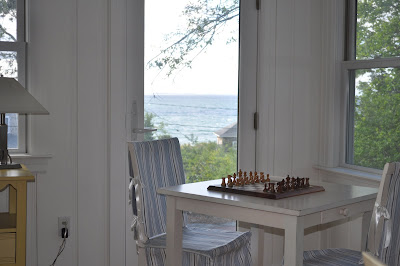
The eating area before. When we originally purchased the house, the half wall was actually a full glass window and a a door. We winterized the porch and opened the area up. It really visually enlarges the space.
The after photo shows how cohesive the space looks with it all painted a uniform color.
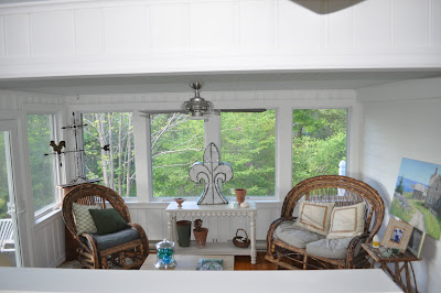
Here is a close up of the four season porch before. And the amazing after!
Here are close ups of the Willow Furniture I bought off the back of artisan's truck 10 years ago at a flea market. I have owned the weather vane for 20 years. I bought it at a barn sale in North Carolina. Wisteria is now making an exact reproduction. So now I am not sure that mine is actually old or a 20 year old reproduction, but I love it just the same. You can see I keep moving the accessories around.
 We still have a lot unpacking and finishing to do on these rooms. I have some roman shades ordered and a really fabulous fireplace screen on the way. We will get to all that when we move up there for summer in June, but I wanted to share with you the progress to date.
.
We are so thrilled with how it turned out. My husband turned to me and said "I can't believe this is our house!" A little bit of paint can really transform things- I hope this inspires some of you to paint those wood walls. I'll be posting the outdoor transformations once I finish the gardens, so keep reading!
(all photos Willow Decor)


