Almost every one needs more storage in their bathroom. Perhaps we all need to get a bit more organized, but if you are clutter challenged like me, I wanted to show you some wonderful baths by designer, Molly Frey. You may remember a previous post on a fabulous coastal house by Molly
here.
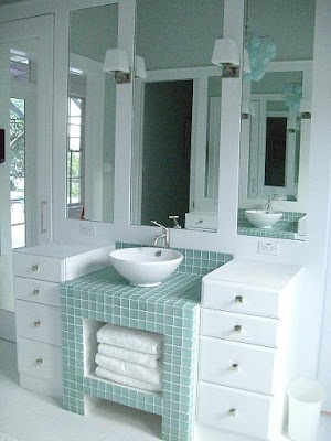
I love the bath above. Let's take a look at some of the elements that make this bath fantastic. First, the overall design with the sink sitting upon an open turquoise glass tiled cabinet - a perfect spot for storing extra towels. The wall mirror is framed out with sconces adding the perfect lighting.
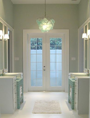
A capiz shell chandelier adds a bit of whimsy to the space. I imagine the french doors lead you outdoors to a secluded hot tub - wishful thinking? I also love symmetry and this bath is a great example.
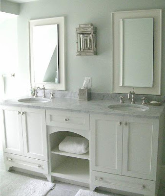
Of course Molly's marble baths are what generally catch my eye. Here is lovely example that was published in Traditional Home Magazine. The middle cabinet is open - again a nice spot for baskets or extra towel storage. Notice that the cabinets have "feet" to give the sink base the illusion of free standing furniture. I also love the sconce in this bath.
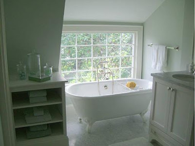
The tub is tucked under the eaves of the home in front of a gorgeous window and next to it we see another area for storage.
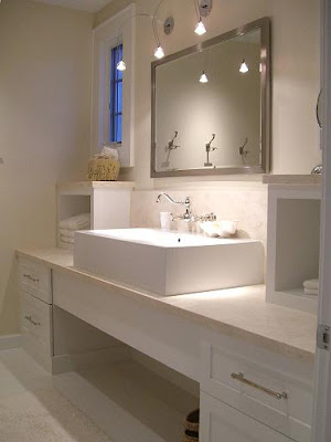
Here is a more streamlined, contemporary feeling bath. Two small boxes topped with limestone add the additional storage here. By not putting small doors on these, the look stays very open and contemporary - Interesting!
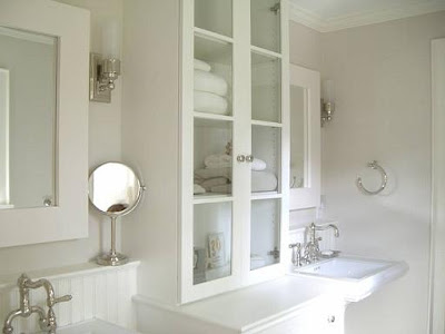
A more traditional design also shows you some ways to increase storage. Here the cabinets flanking the pedestal sinks sit directly on the counters. Unlike a kitchen, counter space in the bath can be more narrow to support your toiletries. The small ledge behind the sinks also add a space for lotions and creams.

Here we see a shallow medicine cabinet with mirrored doors built into the design. Not only is this cabinet functional, it becomes a wonderful focal point. This bath also has "feet" on the cabinet base.
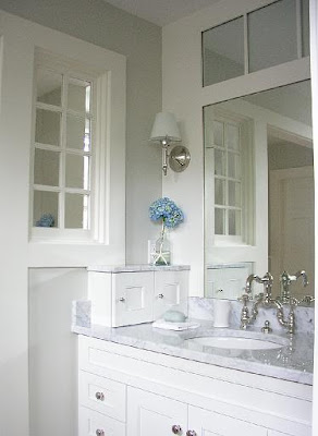
The final bath has this cute little cabinet on the left side. A great spot for a razor and shaving cream - or perhaps it hides electric outlets and a blow dryer.
Above are several ideas to add a bit storage to your bath. To check out more of Molly Frey's work click
here to her website or
here to her blog!
(all photos property of Molly Frey)


 Almost every one needs more storage in their bathroom. Perhaps we all need to get a bit more organized, but if you are clutter challenged like me, I wanted to show you some wonderful baths by designer, Molly Frey. You may remember a previous post on a fabulous coastal house by Molly here.


 Here is a more streamlined, contemporary feeling bath. Two small boxes topped with limestone add the additional storage here. By not putting small doors on these, the look stays very open and contemporary - Interesting!
  A more traditional design also shows you some ways to increase storage. Here the cabinets flanking the pedestal sinks sit directly on the counters. Unlike a kitchen, counter space in the bath can be more narrow to support your toiletries. The small ledge behind the sinks also add a space for lotions and creams.
 Here we see a shallow medicine cabinet with mirrored doors built into the design. Not only is this cabinet functional, it becomes a wonderful focal point. This bath also has "feet" on the cabinet base.
 The final bath has this cute little cabinet on the left side. A great spot for a razor and shaving cream - or perhaps it hides electric outlets and a blow dryer.


