My Toy Room to Teen Room Transformation!

My children are entering the teen years now. As they grow and change the needs of our home have changed as well. One of the bedrooms over our garage had been a "toy room", filled with plastic Little Tikes Kitchens, Legos and Trains- a place for forts and building castles. My teenage daughter suggested that we re-decorate the "Toy Room" to be more Teen Friendly. I agreed and so (sadly for Mom) we have said to goodbye to Pokemon and American Girl Dolls.
Here is the room Before (actually we have two identical rooms above our garage, they are mirror images of each other and this photo is of other side). Like all decorating projects we had Goals, Restrictions and a Budget. The Goal was a room for for sleepovers, a place to do school projects where they could spread things out (and not be near their parents), and a place to hangout with friends and watch Movies and I-Chat! Our main Restriction was the doorway size. It is only 27 inches wide. And our Budget was $2500.
Here is the room after we ripped up the old carpet. Then we painted the trim BM White Dove and the walls BM Lighthouse Landing. Paint cost $4o. Paint, as always is an immediate improvement!
The kids were allowed to choose everything in the room and I treated them like clients on our shopping trip. We found this great, thick wool rug at HomeGoods for $600. (did I mention how much I love HomeGoods for rugs??) The kids liked the Pottery Barn feel and the blue and brown color scheme. While we were there the kids scouted some great pillows that matched and two small microfiber ottomans. All together we spent $800.
Meanwhile at home, my sister, who LOVES to organize, came over and sorted through all our arts and crafts supplies and organized everything in the old bins which used to hold plastic food and Matchbox cars. Now it is a perfect go to space for all the supplies we need for projects at school.
Thank you, Sandra! Cost - priceless!
We couldn't let go of the blocks, (well I couldn't) so they stayed put and we moved an old bookcase into the walk in closet for extra storage for paper and other supplies.
Dramatic drum roll.... Here is the Before.
And the After! We found this thin couch at Macy's and once we took the feet off it fit through our tiny doorway! The sectional microfiber couch was $1400 and the bar table and leather stools $199. at Overstock.com.
Inspirational artwork was $50 on clearance! Bookcase, side table, and TV we already had!
The total Teen Hangout Room Makeover cost was.....$2489!!
We still had money left over for a Movie and some snacks!! We found some wonderful bargains, stayed with in our budget and came out with a great room! The kids are thrilled and call it their "Hang Out Room" - I call it a success!!
'
Also a heartfelt thank you to the many, many kind readers who sent me get well wishes and prayers. I am truly blessed to have so many friends in blogland. I was beyond touched! xoxo
(all photos Willow Decor and not to be copied without permission)

Sprayfärga glasflaskor ?

Såg ni 'Äntligen hemma' häromdagen med Karin Mannerståls kakfat. Hon byggde kakfat av gammalt loppisporslin genom att klistra prylarna ovanpå varandra och sen sprayade vita med speciell färg för glas. Hur fint som helst och en kul idé. Om man gillar den mer minimalistiska stilen kanske man kunde göra något liknande med flaskor. Har inte testat men det borde gå, jag har satt upp det på min pyssellista, nej skämtar, men blev lite sugen när jag såg den här bilden från Living Etc.

It wouldn't be that though to spray bottles like this. I would like to try it but haven't got the time. Its on my to do list for a day with more time. Take a look at the tv show 'Äntligen hemma' were they do something similar with flea market glass and plates. Image Living Etc.

{ The winner is... }

Do you remember this giveaway?

 The winner is chosen on Random.org, and...

 Congratulations, Kjersti! Please send me you address to nina(at)stylizimo(dot)com

Thanks to everybody else who participated!


Images: Nina Holst

{ Happy Halloween! }

Are you celebrating Halloween this weekend? As a Norwegian in USA I have to say that there is a huge difference between how we celebrate in Norway and USA. Here in LA it's decoration in almost every garden and house (lots!), and most people dress up in a costume and walk in a Halloween parade.

 I have to admit that I haven't decorated our apartment that much. I'm really not into the orange and scary decoration. I do have some pumpkins in different colors though.

How do you celebrate Halloween where you live? Do you decorate for the occasion?

Enjoy your Saturday!


Images: Nina Holst

{ Halloween: table setting }

I know it's a little early to decorate the table for Halloween, but yesterday was my only chance since we have other plans this weekend. It was kind of fun to do something different, and I like the dramatic look our dining table got. With a black tablecloth, some pumpkins, pine cones and candles on the table we are all set for a "Halloween dinner"!
I made some cute notes in each bowl using gift tags and letter stamps.
I wrote the words: EAT, DRINK, LAUGH and ENJOY.
Are you going to do anything extra with your table setting this weekend?
Tell me all about it!
Wish you a great Friday, my lovely readers!


Images: Nina Holst

{ DIY: Halloween decoration! }

One of the members on Stylizimo.com has uploaded some very cool Halloween decoration that I want to show you...
She used an orange instead of a pumpkin! How smart is that?

Have you decorated for Halloween yet?
If you want to upload your Halloween decoration on Stylizimo.com, you can do it here. I would LOVE to see it!

You can see more photos of her decoration here, or you can visit here lovely blog Norwegian Moods here


Images: Norwegian Moods / Stylizimo.com

Ännu mer Guts...

Louise Svensson kör inte bara svart och vitt utan även brunt, grått, betong, slitet trä och en del rostigt. Helt enkelt lite mer ruff och rå känsla. Foto Jonny Lindh.

Louise Svensson also have some styling that really is rough and tough with concrete, wood and steel - much more guts! Images from Jonny Lindh.

Enkelt och snyggt med magkänsla

Har ni sett nya stylisten Louise Svenssons sköna stil. Louise driver företaget Guts som fått sitt namn från de två viktigaste ingredienserna i hennes arbete - mod och magkänsla. Härligt med allt det svarta och vita, måste helt enkelt ta till ett av mina favorituttryck - Enkelt och snyggt! Foto Jonny Lindh. Via Trendenser.

Take a look at the new swedish stylist Louise Svensson from Guts. No need to explain the cool name. Love the black and white theme. Images Jonny Lindh. Via Trendenser.


{ The interior shop: "Kremmerhuset" }

The Norwegian store "Kremmerhuset" is really worth a visit if you're ever in Norway. They always have their store filled with great stuff and as I can see from their website, this fall isn't any exception.
I've put together some of my favorites so you can see for yourself.


If you want to see more of their collection you can click here.
( Their site is unfortunately only in Norwegian, but you can enjoy the photos *smile*)


Do you like what you see?
If you're living in Norway, do you buy home decoration from Kremmerhuset?


Images: Kremmerhuset / Collage made by me

{ DIY: Ice candle }

My creative mom made this beautiful ice candle with tulips. I think it's so lovely and I want to share the idea with you.

This is how you can make your own:

 1. Fill up a big bucket with cold water.
2. Put flowers, pine cones, twigs etc. in the bucket
3. Then but a smaller bucket inside the other bucket to make a hole for the candle.
4. Put something heavy on the top, or use tape to hold the little bucket down.
5. Freeze the water outside or in your freezer.
 6. When it is ready, remove the buckets and put a candle in the hole.

This can also be a great way to serve seafood in if you are going to impress your guest - try different shapes for different purposes.

A perfect way to welcome your guest, don't you think?

Good luck!


Thank you mom!

Mitt senaste inköp - vasen Focus

Jag får ganska många mail med frågor om vilka saker jag tycker är snyggast, vilket bord som är det snyggaste eller vilken vas jag tycker bäst om eller vilken fåtölj som är den snyggaste av alla... Alltså frågor om detaljer snarare än hela inredningsstilar eller ren inspiration som jag oftast brukar skriva om. Jag uppskattar frågorna, men det är väldigt svårt att svara, eftersom även om jag har mina favoriter så kanske de inte passar in överallt. För mig är alltid helheten viktigare än detaljerna. Men jag tänkte att jag kan ju alltid visa vad jag själv köper, när jag väl köper något, så här kommer en ny kategori - 'Mitt senaste inköp'. Vilket den här gången är en vas från Design House Stockholm, en ny modell av Focus som är något bulligare än den tidigare. Tyckte den skulle passa bra in på mitt matbord. Bilderna är mina egna.

I get a lot of mail from readers that wants to know which details I like so I will start to show you my latest buy. Under the category 'Mitt senaste inköp'. This time its a vase from Design House Stockholm called Focus. I think it looks good on my dining table. Images of my own.

And That's Where I've Been...

Why are hospital rooms so uninspiring?
It's been a crazy few weeks. I have been in and out of the hospital and had lots of tests. Luckily we have ruled out all the major ailments - and for that I feel very blessed.

I have spent a lot of time at home nesting... I promise to be back soon when I am back on my feet with photos of some of my new projects. xx-Gina

Stora marockanska mässingsfat

Den här helgen drog mannen med mig på matmässa i Malmö - Älska Mat. Medan han rusade rakt på ostronen fastnade jag så klart bland pralinerna. Criollos choklad hade lagt upp sina läckerheter på vackra marockanska mässingsfat. Fat som är perfekta att servera på men också vackra som prydnad. Mässing är ett klart underskattat material men som man börjar se mer och mer av just nu. Riktigt snyggt till det svarta, bruna och murriga som är så inne i höst. Och chokladen... ja, den smakade så klart gudomligt. Bilderna är mina egna.

This is from a food exhibition that we went to last weekend. I just love, yes the chocolate of course, but also the Moroccan brass trays that it was served on. Looks great to the new dark autumn trend of brown and black. Images are my own.

{ Decorating walls }

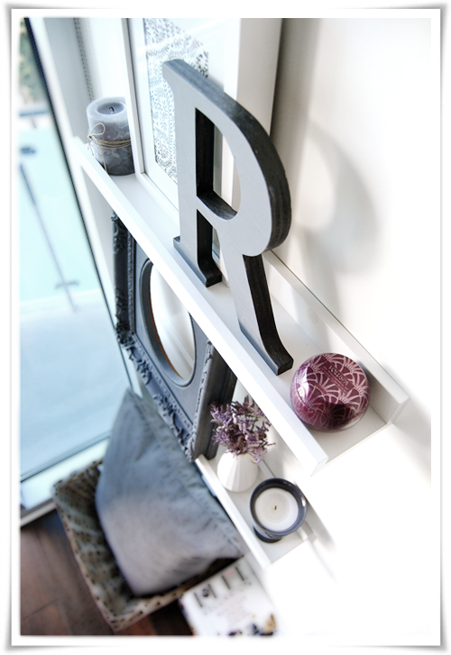
I find it kind of hard to decorate walls sometimes because I like to change the look very often, and I don't want to make a lot of holes in the wall. Therefore I've fallen for these shelves where you can put different decorations, and when you get tired of the look you easily can replace the items with something else.
This is how the shelves in our living room looks like right now
Magazines can be very decorative as well. I've stacked some of our magazines under the shelves beside a basket with a pillow. Now the wall went from empty to way more decorative. 
We have these kind of shelves both over our bed and in my home office. You can see how I decorated them here and here.

How do you decorate your walls? Do you often use shelves as well?


Images: Nina Holst

Slitet kontra modernt i skön förening, kanske är det du..

Jag är väldigt fascinerad av olika sorters stil. Den här, ja vad ska man kalla den, slottsdekadens kanske, har jag blandade känslor inför. Det är egentligen för slitet för min smak, men den tilltalar mig ändå för den har något vackert och spännande över sig. Men tänk den här stilen tillsammans med den i Illums Bolighus skyltfönster med det fyrkantiga järnbordet med träskiva och detaljer i stickat. Helt plötsligt skulle det bli intressant, även för mig. För det är precis det här det handlar om - att hitta sin stilmix. Blanda och sätta ihop det man gillar tills det blir något alldeles eget. Bilder från fotograf Rachel Whiting.

This style fascinates me, even if its a little bit to shabby for my taste. But if you mix this style with the modern in my earlier post about Illums Bolighus (whith the rustic table and the knitting details), it will be really interesting even for me. I think this is what its all about, mixing styles according to your personality until you find what really is you. Images from photographer Rachel Whiting.

{ Light and pretty apartment }

Isn't this Swedish apartment charming? I see a lot of things in this home that I LOVE;

I the shelves in the bedroom
I all the white
I the light
I the wallpaper behind the bed


I the kitchen lamp
I the floor
I the cosiness
I the jars in the kitchen cabinet


I the  book shelves
I the grey sheep hide
I everything in the kids room!
I the bathroom 


What do you think of this apartment? Do you see anything you like?


 Images: Stadshem

{ Black & white beauty }

In the Swedish interior magazine "Skona Hem" this month they show us the fancy home of Annaleena who's authoring the blog "Hem". I've been following her blog for a while, and I really like Annaleena's rough and clean style, and she has some great creative ideas when it comes to home decoration.
This is the pictures they showed in Skona Hem, but you can see more on her own blog here.
I love the contrast between the black an the white in this house, and the fact that everything is light, airy and mostly high ceilings.They have decorated the house after the less-is-more principle, which means; they only have things that they actually use. It's probably much easier to keep it clutter-free this way *smile*
Annaleena is also an amazing photographer so I recommend you to take a look at her lovely blog - everything she posts is so beautiful!
What do YOU think of this home? 


Images: Jonas Lundberg via Skona Hem

LinkWithin

Related Posts Plugin for WordPress, Blogger...