Design Trends!


The final installment of my trip to Market was to look at the overall design trends for 2011.


We saw a lot of furniture that mimicked Tara Shaw Maison and Aidan Gray - some were more rustic like Restoration Hardware, some were more chippy and distressed. There were a variety of price points and quality. But if you are interested in this look you will be able to find it at any price. My only caution when shopping is to look at the finishes - some of these vendors are doing great work that looks authentic and others are not. I was very impressed with almost all the pieces from BLISS (above) - they were my favorite vendor for quality versus price.

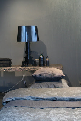
We continued to see in almost every showroom neutrals and linens. This bedding ensemble from Legacy Linens was just beautiful.

But the one new element we noticed the most was the introduction of more organic and textural type materials. We saw more rattan, raw wood and specifically we saw a lot of driftwood/wood.


We saw wood made into sculptures like this wonderful horse -


And this large seahorse!


Pieces like this mirror were in several showrooms but Currey and Company seemed to have the best selection and the best quality.


Here it is with several lamps with wood bases.


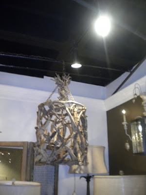
This large mirror was just striking - and notice the chandelier in front.


They had several other interesting Chandeliers like this trellis style.


We fell in love with this standing lamp - we loved the texture and scale.


Their smaller lamps were also interesting. They had several styles like this ball lamp.


and the figure - we loved this one.

Over all we saw little departure from the past year - most vendors playing it safe and neutral with lots of gray, taupe and brown. It was a great trip and I came back even more inspired than before, with many new sources with quality products. I would be interested to hear how you all feel about seeing more of this look and your thoughts on trends for 2011.

(all photos Willow Decor not be copied without permission)

Casbah Moderna

Casbah Moderna är den stil som tilltalar mig mest för att jag gillar det naturliga med sten, puts, trä, järn, korg och metaller. Den här stilen har inget gullegull utan går mer åt det kulturella hållet. Jordnära färger som grått, beige, svart och vitt. Hemma har jag fuchsia, rött och lite orange som accentfärger. Jag tycker om de skulpturala inslagen och är en sucker för kuddar på golvet och puffar av alla de slag. Låga stora långa soffor är också en favorit. Däremot har jag inte tidigare haft några maroccanska inslag utan mer dragit åt det asiatiska hållet. Men vem vet... Så här såg Vincent Grégoires bilder ut för Casbah Moderna. Har fått hjälp av Anna Inreder för att friska upp minnet, du hittar också mer om trendanalysen på hennes blogg.

Casbah Moderna was the style that I liked most. I like the natural materials like stone, wood, iron, wicker and metal. This style is cultural with earth to ground colours like beige, grey, black and white. With a lot of red and purple colours. I have red, fuchsia and orange as accents in my home already. I also like the sculptural elements and love cushions on the floor and all kind of poufs. The big long sofas is great. I usually have been drawn more to the asian style than this oriental but who knows this is a new trend for 2012 and 2013. These are Grégoires images that describe the style.

Foto - 1-2 Anna avfotograferat från föreläsningen, okänd ursprungsfotograf, 3-4 Mark Eden Schooley (via Lotta Agaton), 5 röda skålar från Rina Menardi, 6 trådskålar från Marie Christophe.

{ A peek of our living room }


Hello everybody! How are you? 

I thought I would show you some more details from our living room today. Things are coming together even though we haven´t gotten our things from Los Angeles yet. (Yes, I´m sick of waiting, and it seems that we have to wait for at least 3 weeks more! Much longer than I expected, so I actually feel kind of sorry for myself)
  
You can view more pictures from our living room here.

I have a small new project going on, hopefully I´ll have some pictures to show you tomorrow - stay tuned *smile*

Have a lovely new week!


Images: Nina Holst

Trendanalys av Vincent Grégoire

Under mässan höll Vincent Grégoire från franska Nelly Rodi en trendföreläsning om vad som kommer att vara i fokus under 2012 och 2013. Ganska långt framåt alltså, men det här var väldigt intressant. Inte bara för att det handlade om trender utan framförallt för att det var spännande att se allt från ett annat håll än ett svenskt perspektiv. Det här var faktiskt den stora behållningen av mässan eftersom Grégoire inte bara hade en underbar engelsk franska utan fullständigt pumpade fram idéer under hela föreläsningen. Lyssna på en snabbgenomgång på youtube här.

During Formex Vincent Grégoire french trendspotter from Nelly Rodi presented the new trends for 2012 and 2013. He was very inspiring and it was a great to listen to his ideas and also to see all this from a non swedish perspective. Loved his accent, you can listen to him on youtube here.

Så här såg hans fyra trendinriktningar ut.

Foto Charlotte Bladh, Hemmariket

Indian Dream - engelskt teaparty, feminint, fuchsia, glamour, exotiskt, sött, cupcake, mörk rosa, grå, lila, rosa budoir, shabby chic, bling bling, blommor, indien, silke...

english teaprty, feminine, fuchsia, glamour, exotic, sweet, cupcake dark pink, grey, purple, budoir, shabby chic, bling bling, flowers, india, silk

La Maison du Bonheur - skandinavisk, blommigt, silver, retro, virkat, akvarell, gulligt, naturligt enkelt, tjejigt, romantiskt, färgglatt, harmoniskt, trä, ateljé, sextiotal, milda pasteller med en twist...

scandinavian, flowery, silver, retro, knitting, water colour, sweet, natural, simple, girly, very colourfull, harmony, wood, studio, sixties, pastels with a twist

Casbah Moderna - medelhavet möter Tunisien och Marrakech, orientalisk, sofistikerad, men mer designad, skulpturalt, maskulin, lounge, vitt, beige, silver, röd, lila, orange mixat med svart/vitt, kuddar på golvet, folklore, korall, less is better, korg, exotiska röda blommor...

Medditeranean meets Tunisia and Marrakech, oriental, sofisticated, more designed, sculptural, masculine, lounge, white, beige, silver, red, purple, mixed with black and white, cushions on the floor, folklore, wicker, coral, less is better, exotic red flowers

Jet Set Splash - Miami, latinskt, sommar, poolparty, style, humor, ironi, tropiskt, aquafärger, blått, lila, turkos, gult, vitt, mix med vitt och guld, vintage, sextiotal, Luis Vuitton, kitsch, lyxigt, bananblad, kaktusar...

Miami, latin, summer, pool party, style, humour, ironi, tropical, aqua colours, blue, purple, turquoise, yellow, white, white mixed with gold, vintage, sixties, Luis Vuitton, kitsch, luxuary, banana leaves, cactus...

Där fanns något i varje grupp som tilltalade mig men det var ändå en som jag tyckte bäst om och blev lite glad att den stilen är på gång igen. Det är inte så lätt men kanske kan ni gissa vilken jag föll för?

Not an easy task, but which one do you think is my favourite?

Kolsvart på Illum Bolighus

Igår var jag i Köpenhamn, har ju fördelen att det nästan går lika snabbt att köra över bron som in till Malmö. Rätt lyxigt faktiskt. När jag är där brukar jag alltid kika i Illum Bolighus skyltfönster för jag de har oftast den mest fantastiska skyltning och är lite av en trendindikator. Nja, trend vet jag inte men det var helt svart. Om det ser lite grå brunt eller blått ut på mina bilder så är det kameran som ljuger (eller jag som inte kan det där med att fota svart) för hela skyltningen var kolsvart! Men vad är det med danskar och det där med ugglor?

I live in Sweden but close to the bridge to Copenhagen so I try to go as often as I can. When I'm there I don't want to miss a look at the shop window of Illum Bolighus who always have the most magnificent decoration. Also very trendy. Yesterday it was all black! (Actually much more black than it looks on my photos).

Foto Purple Area

{ Restoration Hardware }

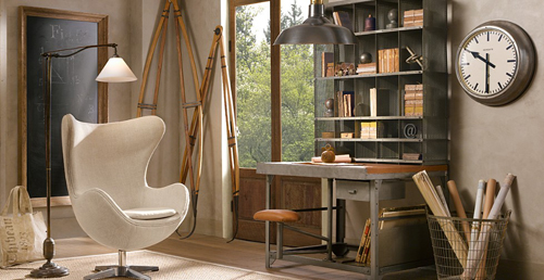
Restoration Hardware was one of my favorite stores when I lived in the US. Maybe you understand why when you see these pictures from their collection...


I love all the old looking wood furniture that they have. It´s such a great mix with the industrial style that are so popular these days.
You can see more on their homepage if you like.


Have a sweet Saturday, lovely people!


Images: Restoration Hardvare

Tara Shaw Maison - America's Mart Part III


One of my most favorite areas at the Market is the "High Design" section. It houses beautiful temporary showrooms dedicated to those designers that have very exclusive lines. Of course Tara Shaw was there, amid a backdrop of chocolate brown walls, with the most beautiful furniture.

It was so fun to see my friend Tara Shaw again! As usual her "Maison" Line stopped everyone in their tracks. She has added over thirty new pieces and her beautiful collection has over 75 items now. Let's have a look at some of my favorites:
The Italian Grisaille Panels were just stunning. You all know how I love Grisaille (to read my post on Grisaille click HERE). These panels were almost a perfect pair in gorgeous sepia tones.

Her new upholstered pieces were also beautiful. I loved this Italian Monogram Chair. It can be custom monogrammed to your specifications.
People were buzzing around the Baroque Canape - the back is removable so it is like two different pieces in one.


The silver leaf bench had a much more beautiful finish than my camera captured and look at all that hand carving.


The Italian Fragment mirror would be a fabulous focal point in any room - it's beauty really commands attention.

It was hung over this Italian Buffet. The finish of soft blues and golds were just extraordinary.


Of course she also had her signature lighting, but this Gilded Iron Corona Chandelier really caught my eye.
And the popularity of her small crowns prompted her to create this Corona on a stand. So many beautiful new things to see and wish for!! If you are interested in purchasing any of these fabulous items do let me know and I can send on pricing and shipping estimates.


By the way , my friend Millie, of M Design and Consultation, is now Tara Shaw's exclusive Interior Designer, you can contact Millie HERE. You can read all about my visit to New Orleans with Millie HERE. And my previous post on the Tara Shaw Maison Line HERE. To visit the Tara Shaw Maison website click HERE.

See you in few days with my final post - Trends at the Atlanta Market. Until then I will be shoveling out from under another Boston snowstorm!! Did I mention my back hurts??!!

{ Enjoy the weekend! }

Wonderful, wonderful Friday! The sun is shining and we have the weekend in head of us! How great is that? Any plans for this weekend? I actually don´t have any plans yet, so I guess I´ll just relax. Hopefully I will find something better to do * smile *


I´m happy to see that I got a lot of new followers lately and I want to welcome you all to Stylizimo blog. I hope you will enjoy the inspiration.

Wish you all a wonderful and sunny weekend!


 Images: Nina Holst

Vitt och för säsongen laxrosa

Det här fantastiska hemmet i Bryssel var med i årets första nummer av Boligmagasinet. Designern Johanne Riss har i sitt hem satsat på en helvit bas med en röd-orange nästan laxrosa accentfärg som hon byter ut efter humör. Vilken smart idé. Både en snygg helhet och snygga detaljer. Lägg märke till de små borden vid matbordet som man, skulle jag tro, kan anpassa till hur många man är.

Take a look at the designer Johanne Riss home in Bryssel. A white base with this red-orange-salmon colour that she change every season. Its a great idea and the result looks stunning both in total and in details. Notice the smart idea with the dining table. Love it!

Foto, Boligmagsinet, Morten Holtum

LinkWithin

Related Posts Plugin for WordPress, Blogger...